Technical skills
Interactive Media Products
Goal: You orient in the relevant tech, media and design landscape and create interactive media products that you have tested with users and stakeholders.
Portfolio Prototype
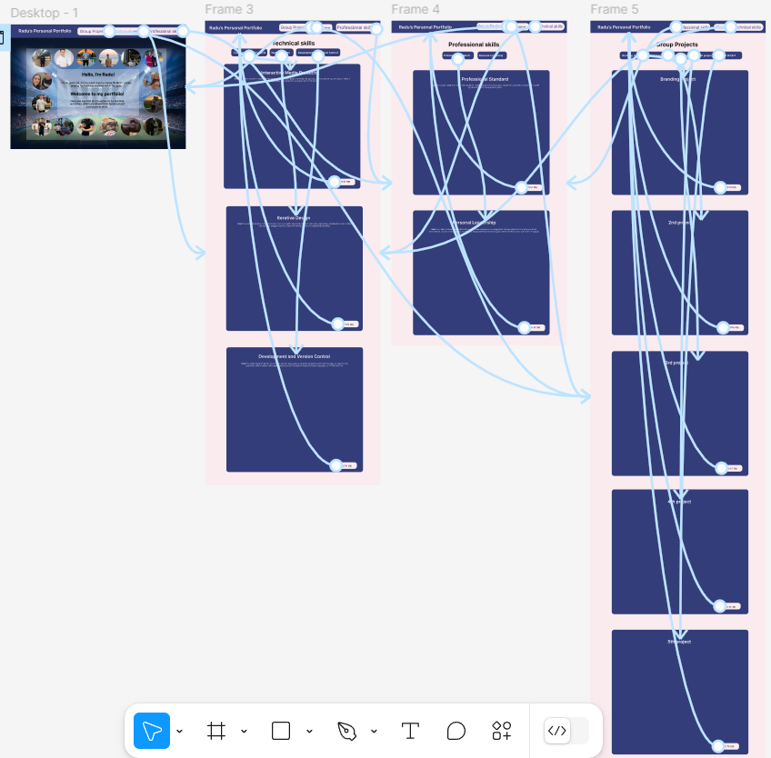
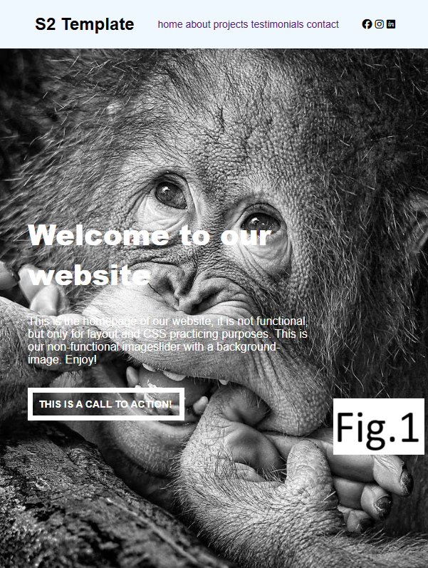
Introduction: I made a desktop version of an interactive media product for my portfolio for 2nd semester. You can click on Figma Prototype and try it yourself! I chose to do just the desktop version because my target audience (teachers) are going to evaluate my portfolio just using their laptops and not their phones.
What did I do: I made an interactive prototype for my portfolio so I have an idea how it is going to look like, especially the design on “professional, technical skills and group project” pages. I spent a lot of time looking for the perfect pair of colors so the content can be easily readable for teachers and so it also to look good. As for example, there will be a lot of information displayed on the screen so I searched for a pair of colors which is not going to make teacher’s eyes easily tired. Also I spent some time organizing the photos on the “home page”, as each of the photos has a specific place and size in the layout I chose for the “home page” forming a rectangle from all personal pictures I chose. In terms of content I also thought in a way so the text is not too long in a row which will make it difficult to read, I thought to put photos on the left side and the text on the right side.
How did it go: It went pretty good even though I spent a lot of time prototyping and implementing the portfolio and in my opinion the result is worth it. Now I have to fill in with content which is actually the main part of the portfolio and I have to focus on this part.
What did I learn: I learned how to make an prototype interactive by adding functional buttons which either will send you to another page or will automatically scroll till a specific place on the same page. Also I found out how to make a button scroll down automatically till a certain point on the same page and to do it smoothly which is also was something new for me. I used this technique in every page on my portfolio so the teacher can just click on the button and go to a certain learning outcome automatically and also in case he wants to go back he can click on “Go to top” button. All of these features were approved after user testing with a professional UI/UX designer Jo-An who said that these are some useful features to have. Also based on her feedback I changed the button which redirects to different pages of my portfolio. I made a “Learning outcome” button by hovering on you can choose on which page to go.
Competitor analys
Introduction: This is a competiror analys for the branding project which was made by me and Julien. I decided that this is a proof for Interactive Media Products because of a suboutcome called Relevant Tech which is about being informed what's fresh, what's fading out what competitor analys is exactly about.
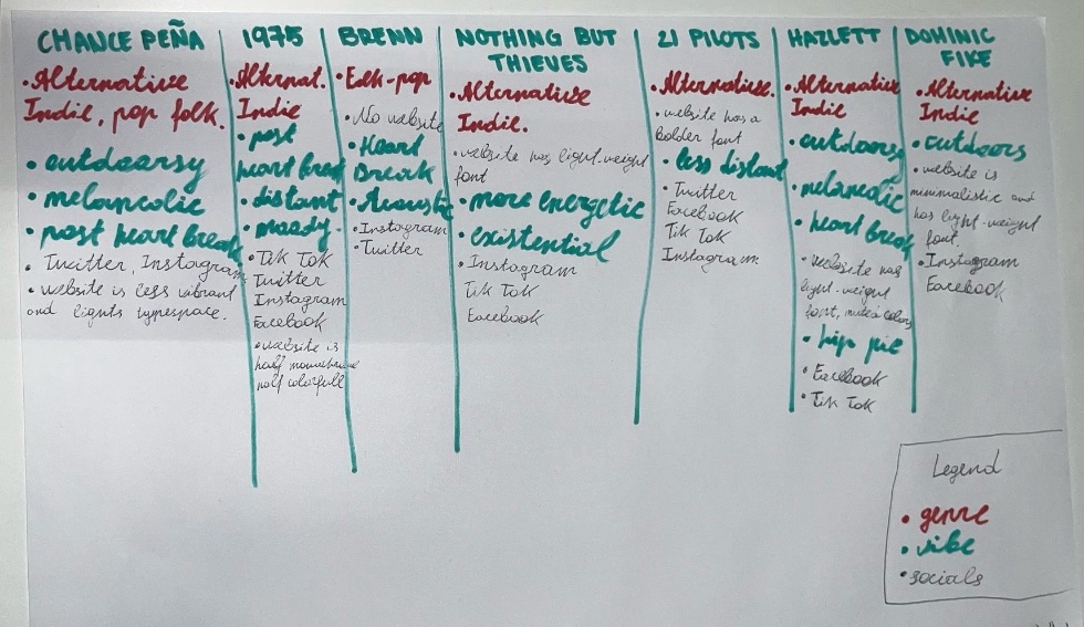
What did I do: I wrote everything down while also helping Julien with research, as we needed to gather a lot of information and analyze multiple artist websites. We selected seven artists from Owen’s playlist—ones he listens to often—and compared them based on genre, vibe, and social media presence. After extensive research, we found many similarities among them. The dominant genre was Alternative Indie, with a post-heartbreak and outdoorsy vibe. Regarding social media, Owen should definitely have an Instagram, as all seven artists do, and a TikTok, since six out of seven use it. From analyzing their websites, we noticed a preference for lightweight fonts, minimalistic design, with pictures of themselves on the website which is a part of the design.. I’ll keep this in mind when designing Owen’s website. (A part of this text was shortened by AI as my initial text was too long.)
How did it go: It went pretty well as we were able to make some conclusions I mentioned above.
What did I learn: It was my first time doing a competitor analys which I didn’t expect to be so useful for us and to have so many conclusions out of this. Now I’m sure to keep this in mind and also use this kind of analys for my future projects.
App design
Introduction: Wouter gave us an assignment to do whatever we want to practice our design skills and I decided to recreate the Sound Cloud app. And the reason I decided to include it as a proof in Interactive media products is because of the suboutcome relevant tech and orient.
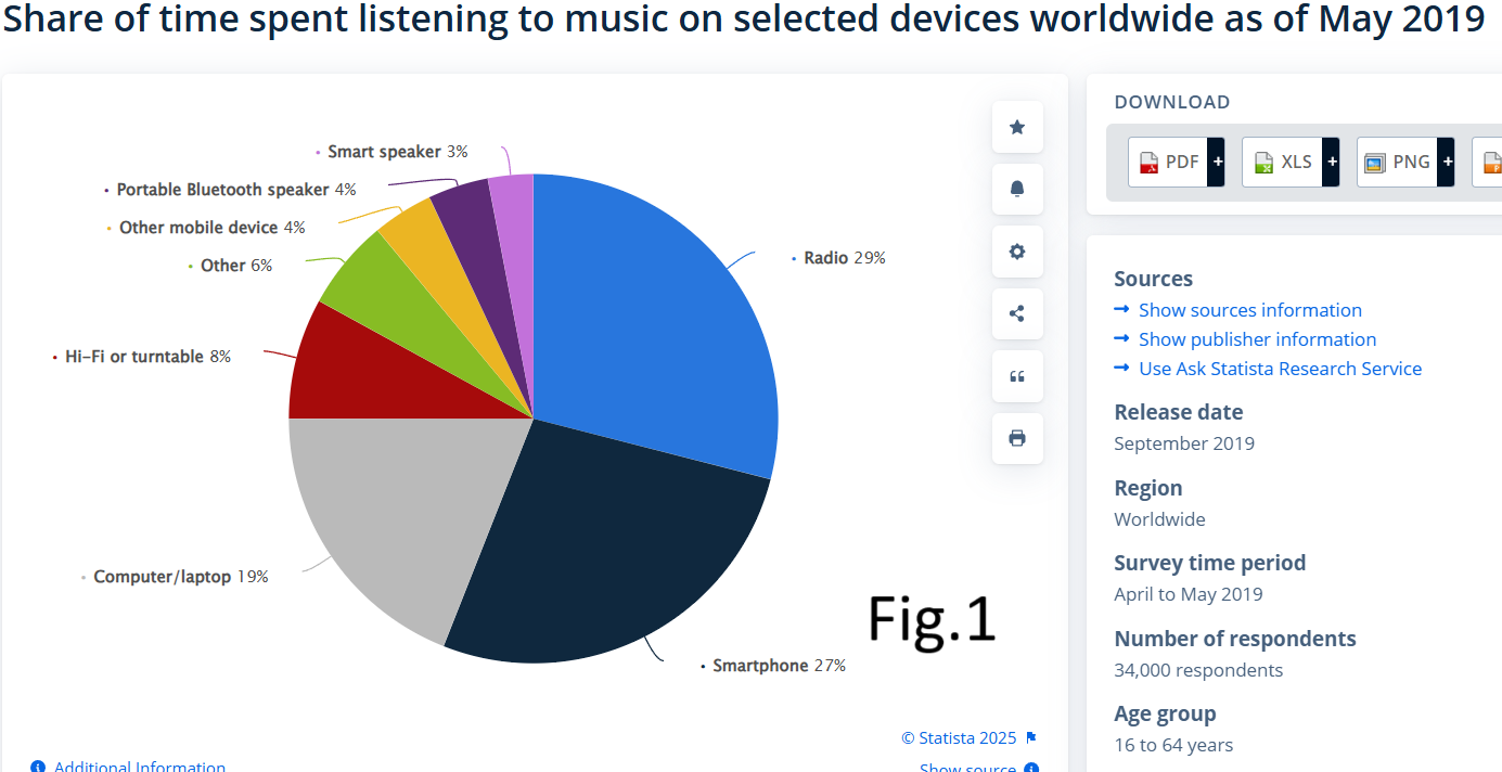
Introduction: I recreated the mobile version of a music app because people tend to listen to music more from their phones rather than any other digital devices usually using headphones. First of all, I thought that it is something obvious that when it comes to music the phone is first thing people listen the music from but on the other hand some people also use their tablets or other just use their laptops or PCs to put music usually in the background. So then, I searched for a statistic to check for which device should I design a music app. And as you can see in the figure radio is on the first place (29%) but as long as radio doesn’t need any designs as it doesn’t have a digital screen I went for mobile version which is on the second place (27%). An important remark is radio here is mentioned as a device which means an old radio and not the radio which you can access from your phone. You can access this link to see the statistic on the website: Click here
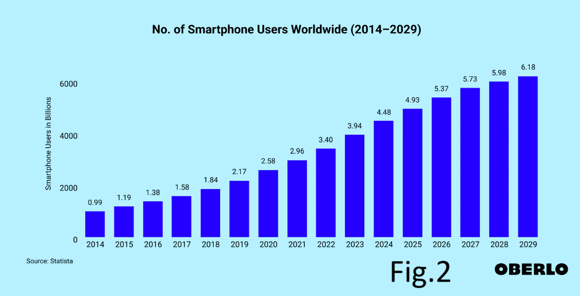
How did it go: In general everything was fine, but the only thing is that I was able to find the latest statistic I need just for 2019 but I think in 2025 mobile usage just increased even more and it increases by every year non stop beginning with 2014 (check fig.2) if you need you can check the website from where I got the statistic: Click here So my decision by making a music app exclusively for mobile phones is validated.
Card Sorting
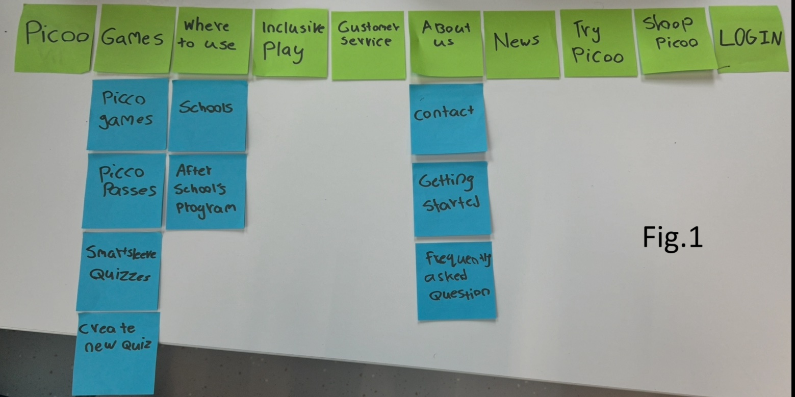
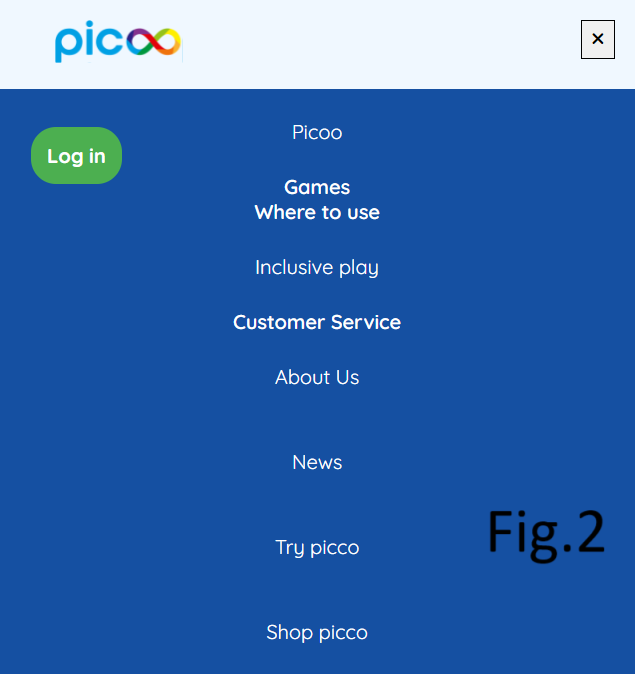
Introduction: I applied the card sorting method from UX/UI classes to find out what information organisation structures are considered intuitive by users so they can define the position of “Create quiz” page in the picco website. I decided to include this proof in the Interactive Media Products LO to prove the “Testing with stakeholders” suboutcome.
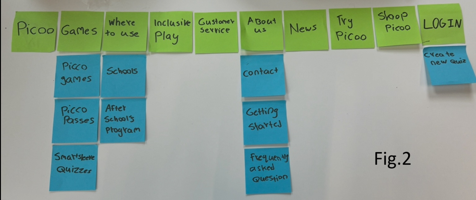
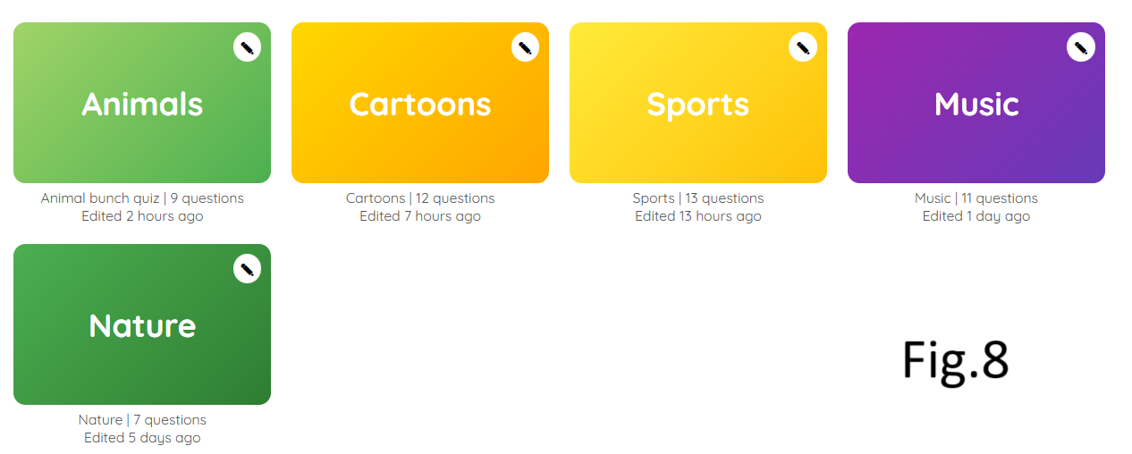
What did I do: I asked 10 people to take part in card sorting, few of them were some random Fontys students and 3 were my roomates. I explained everything they needed to know about picoo website and gave them bunch of subtitles (blue stickers) and asked them to match them with titles (green stickers) After the card sorting I noticed that 7 people put the “Create quiz” subtitle under “Games” title (check fig.1) and 3 people put it under “Log in” title (check fig.2) and said that you must be logged in to create a new quiz.
Conclusion: In the end I decided to implement both options to put the “Create quiz” subtitle so the user has more than one way to be able to create a quiz. I asked Maikel for confirmation and he agreed that it is a good idea from UX perspective.
What did I learn: I learned the how to do card sorting method and what is this in general as I had no idea before that. I understood how useful it can be in case when you are not sure how to structure your website. And also I discovered a new way testing my product with stakeholders which directly proves the interaction with stakeholders learning suboutcome.
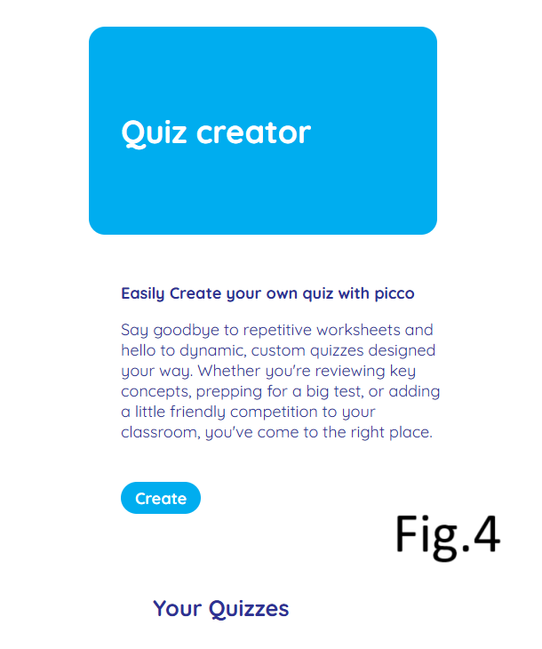
Picoo Prototype (dekstop version)
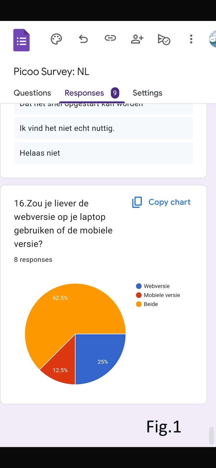
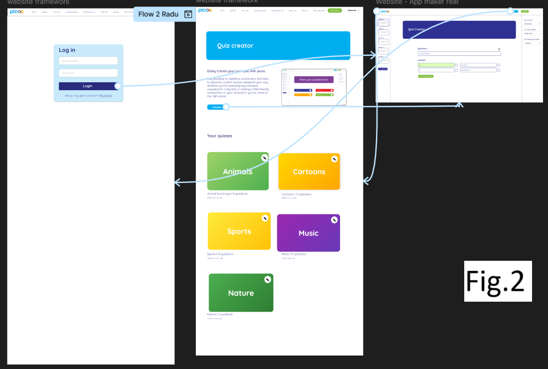
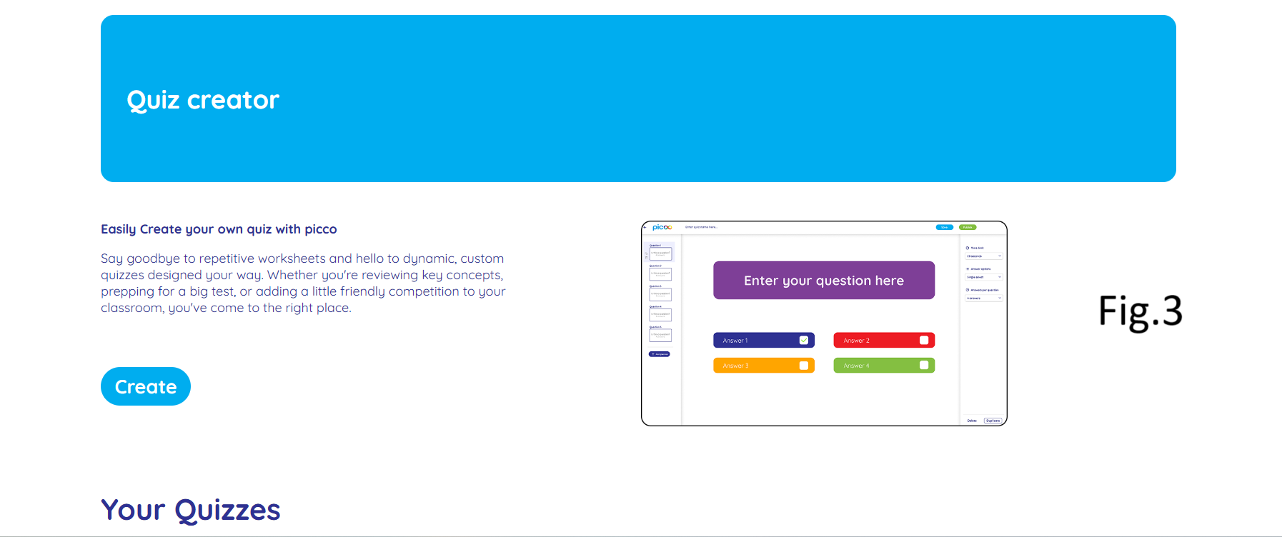
Introduction: Picoo UI/UX prototype project semester 2. If you want to open it in figma Click here. (my prototype is in the top right corner called Flow 2 Radu) So we as a group decided that we need both desktop and mobile versions for users to be able to create a quiz. This decision was made based on our survey which was posted by picoo company on their socials online and the majority of people (62.5%) said that they prefer both versions (check fig.1). So after that we split the work among the group members and as more of them wanted to do the mobile version I chose to do the Dekstop one.
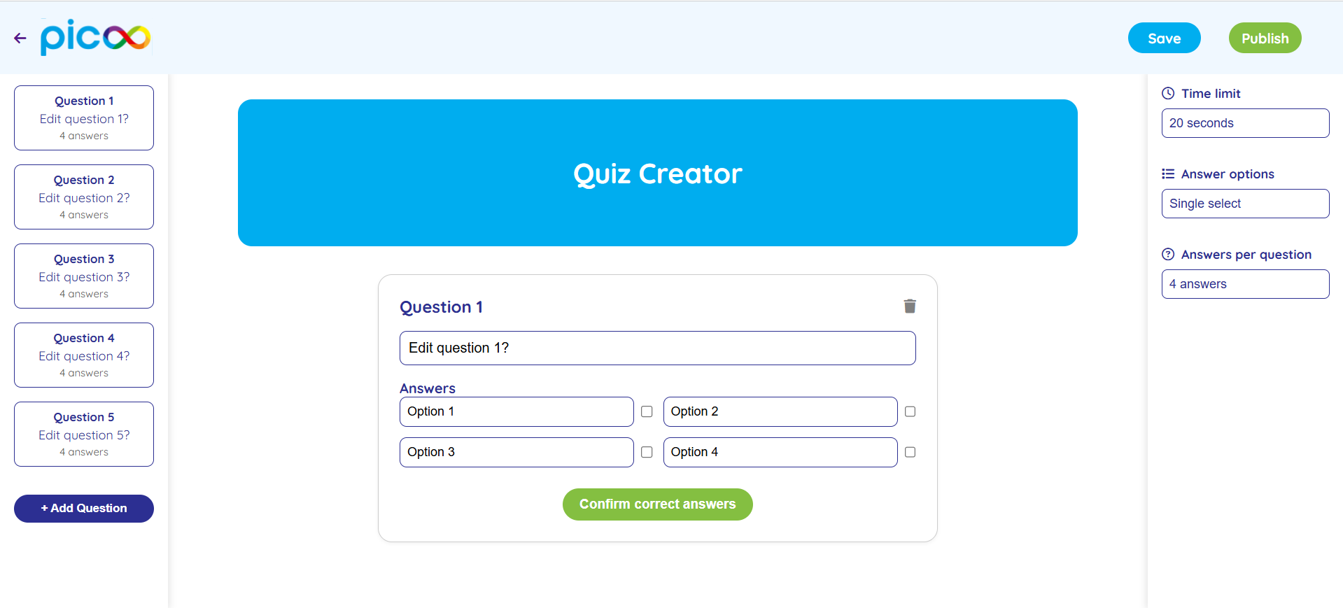
What did I do: I made an interactive prototype for picoo project so the user can create his own quiz (check fig.2 or use the link above to go to figma) . My prototype consists of one Home page where I’m trying to explain the reasons why he might need to create his own quiz and I also put an image of how the “create quiz” page is going to look like so the user has a complete overview of what to expect. And also I did a “Create” blue big button to grab user’s attention by clicking on which he will be redirected to the “Create Quiz” page. If you scroll a little down you will see your existing quizizz. In the “Create Quiz” page I included 2 aside bars: on the left one you see how many questions you have and in case you need more you are supposed to click on “Add question” button. In the center is the question editor itself where user is supposed to compose the question and the answers and clicking the checkbox for choosing the correct answer. In the right aside bar the user can choose the time limit for each question, if he wants to have single or multi correct answers per question and also choosing the number of options for each question. After that if the users decides to save his quiz he just created he will need to log in or create an account. This was made to increase the chances for user to create an account (if he doesn’t have one) after the user spends his time creating his quiz the chances are low for him to give up and not save his work which increases the chances for the user to come back to picoo website and become a client.
How did it go: It went pretty good as from a UI/UX perspective I made the website as clear and as simple as possible and the log in feature explained above is also a good trick that came to my mind during prototyping.
Picoo Project (User Testing)
Introduction: User testing on the Dekstop version of Picoo project.
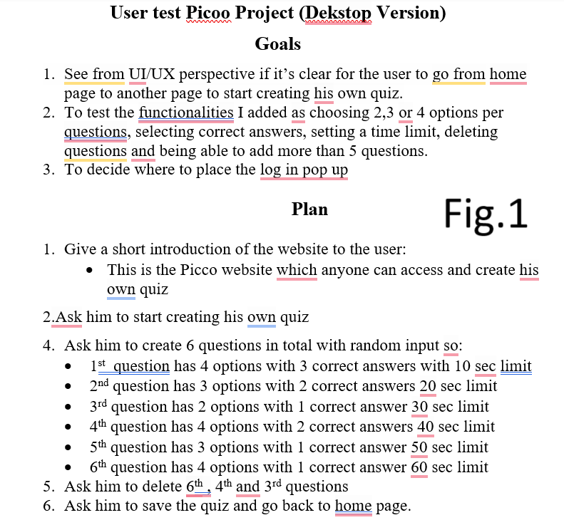
What did I do: I asked my roommate to perform a user test on the Picoo project I implemented myself. But before that, Maikel suggested me to do a plan of what I’m going to ask the user to do. And also in the beginning I should mention the goals I want to achieve by doing this user test. (check fig.1 to see my goals and plan) By doing this user test I wanted to know if it is clear enough for the user to go to “Create quiz” page and also I wanted to test all functionalities I did in order to create a quiz, such as: choosing 2,3 or 4 options per questions, selecting correct answers, setting a time limit, deleting questions and being able to add more than 5 questions. And one more thing I wanted to figure out is where is the best place for the log in pop up as I had 2 options to place it. So I explained to the user both options and tested it out and the user said that he would prefer to be able to create a quiz without being logged in and in case he will want to save the quiz then he will need to log in. When I showed him the second option he said that he might give up on creating a quiz if he needs to create an account first, which is true and I also agree with him as picoo company is going to loose potential clients this way.
Conclusion: So me as a developer decided to make the “Create Quiz” page easily accessible without needing to log in but after the user finishes creating the quiz and wants to save it then he will need to be logged in. What about functionalities of “Create Quiz” page, is that everything was clear for him, he was able to follow all my instructions from the plan without me helping him and he said that the icons are clear what they do, text is readable and it’s easy to select correct answers for each question, which means it is easy for anyone to create a quiz. He also found easily how to go to “Create Quiz” page by clicking on “Create” button on the home page, meaning the website is accessible and easy to navigate.
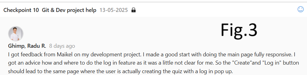
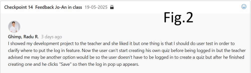
How did it go: Everything went as I expected, even a little better because the user was able to share his opinion on the log in pop up, how it suits him the best. And actually, the whole idea with log in pop up is based on Jo-An feedback (check fig.2) where she advised me to think more about the location of the log in pop up and to do a user testing and see what the user thinks, which is exactly what I did as I explained above.
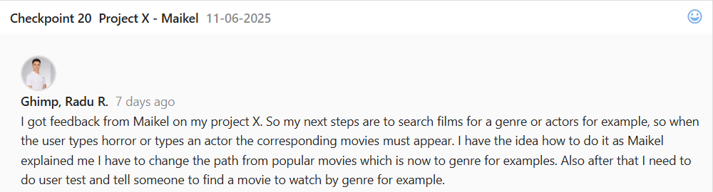
User Testing (Project X)
Introduction: User testing for Project X movie website (for more details click here to go to Development LO where I explain everything in details).
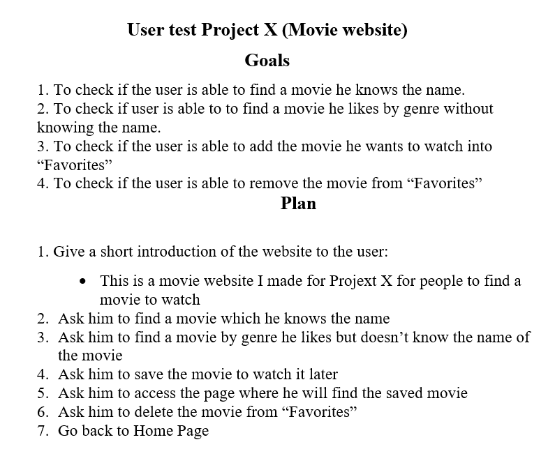
What did I do: I asked my roomate who often watches movies to perform an user test on my movie website where I asked him to do several things based on my User Plan I did before. (check fig.1 to see the plan) I included the goals I want to achieve by doing that user testing and a step by step guide to follow during user testing.
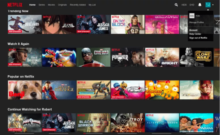
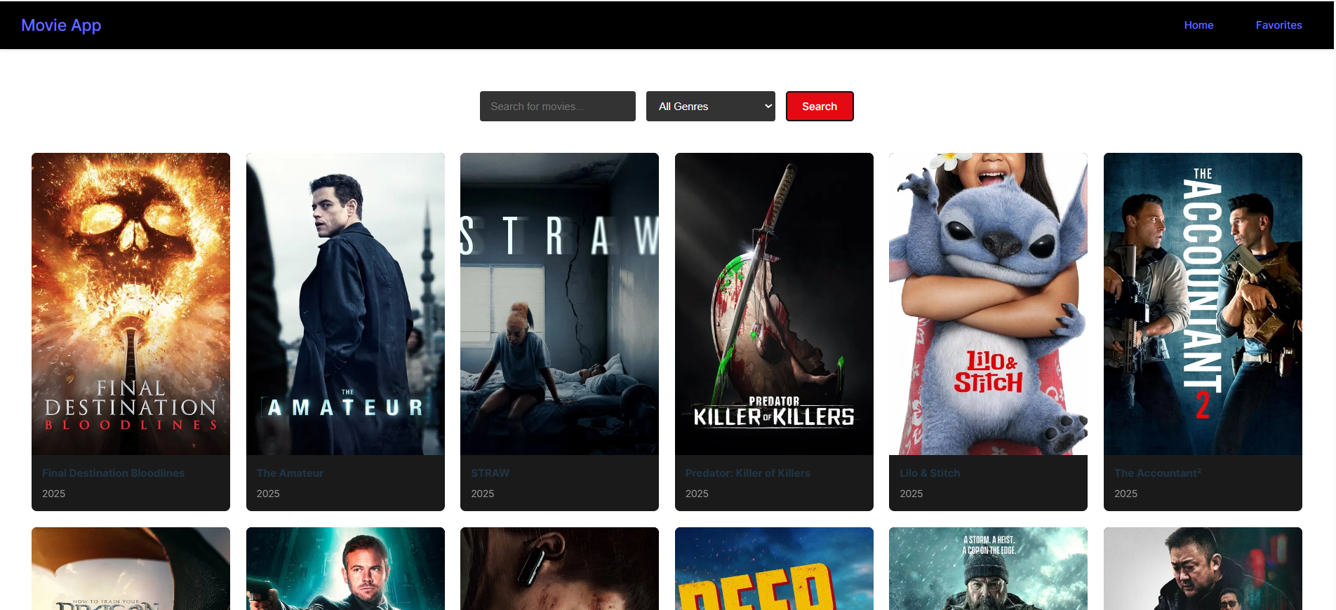
Conclusion: The user was able to find a movie easily if he knows the name of the movie, meaning it is clear where and what to type and how to search. The same thing happened when I asked him to find a movie by genre, meaning it is clear where to click to choose a genre and how to search for it. But he mentioned that he is not used to this layout and for him is kind of weird to search in this way for a movie even though it is still clear, as for example on big movie websites like Netflix each section like “popular on netflix” or each genre is placed in a row and the user can scroll horizantally to check all movies available (check fig.2 to see the netflix page) and the advantage of this is that the user can scroll in 2 genres at the same time which is not possible on my website because you need to search for second genre again. I’m not going to change my website because project X is over, but the feedback is still valuable and it is worth to keep in mind for future movie projects. Also, the user was able to easily save the movie he liked, access the “Favorites" page to see which movies he saved and delete the movies from “Favorites”, meaning my website is still not so difficult in use, even though there are still things to improve as I mentioned above. The reason why my website is not so user friendly is simply because I didn’t think about UI/UX a lot because my goal was to learn react so I was more focused how to make it work rather than accessibility and stuff as I had just 3 weeks to finish it.
Iterative Design
Goal: You explore and use professional design tools and you iteratively design visual works.
Mood Board
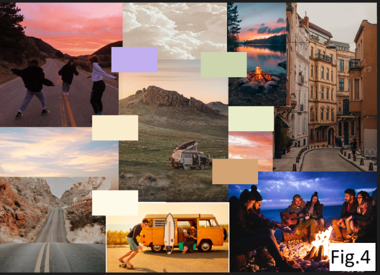
Introduction: I made a Mood Board for the Branding project where Owen Bryce is our client.
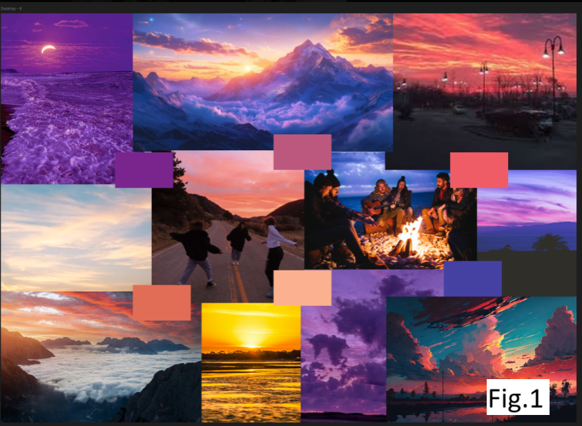
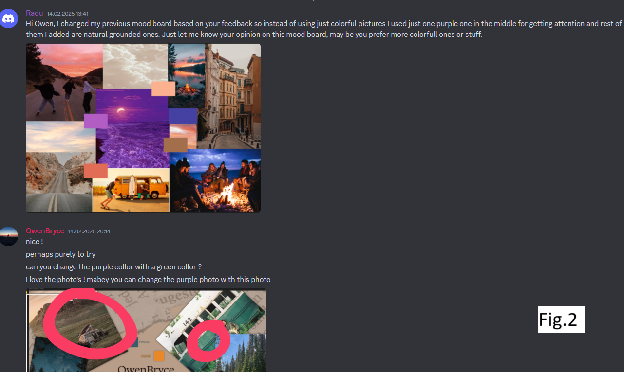
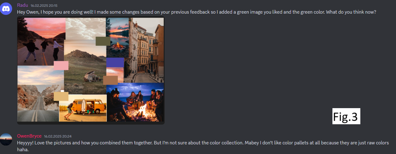
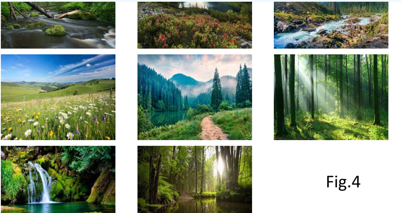
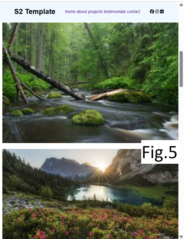
What did I do: I made the first version of Mood Board(see fig.1) based on Owen’s presentation where I tried to get his mood, favourite colors and feelings so I can put it all together in a mood board. After I showed him he said I chose too many colorfull pictures and should have used more grounded colors. So I made the second version of mood board(see fig.2) where I decided to use just one colorfull purple picture and to put it in the center and rest of them are grounded and natural colors. After Owen checked one more time he said that purple doesn’t really fit well there and that I should find a great green picture(you can see his comments also in fig.2 down part) So I started to iterate again and put a green image in the center and also changed some of other images(see fig.3) And finally he liked all the images and how I organized them but there was still a thing with color palette, he said I used too raw colors.(you can see his comments also in fig. 3 down part) By that time Kate worked on a color palette which Owen liked it so I took 5 colors from her but I still needed to find one more which I had to search for. After analysing all possible colors for the color palette me with Owen concluded that this is the final version of our Mood Board(see fig.4)
How did it go: The process itself was a bit confusing as I didn’t know what to expect from Owen especially in the beginning if he is going to like my work or not. That’s why I made so many iterations just to finalize the Mood Board but we are still happy with the work in the end.
What did I learn: I learned how important a mood board is for a project as it gives you an overview of the design of the whole project. It includes main and secondary colors and also the vibe our client has. The mood board was usefull also for interviews where we showed it to people and asked about their vibe and feelings. For example in the 1st semester we weren’t explained what is a mood board and why do we need to make it so I didn’t think how can it help me with my project. But now in 2nd semester I understood that a right mood board can help you a lot in succeeding with your project as it represents all colors and vibe of the future website so you together with your client can agree on minor things during early stage. Also I learned to communicate with the client as many times as possible to keep him informed about my work and getting constant feedback so I can complete many iterations on one thing.
Music app
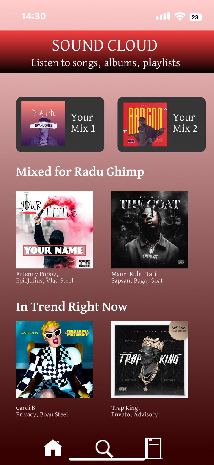
Introduction: Wouter gave us an assignment to do whatever we want to improve our design skills. I chose to recreate my favourite music app from where I listen to music and got professional feedback from graph designer (Wouter) and recreated the app again. The reason I chose the mobile version because usually people listen to music from their phones as it’s more accessible.
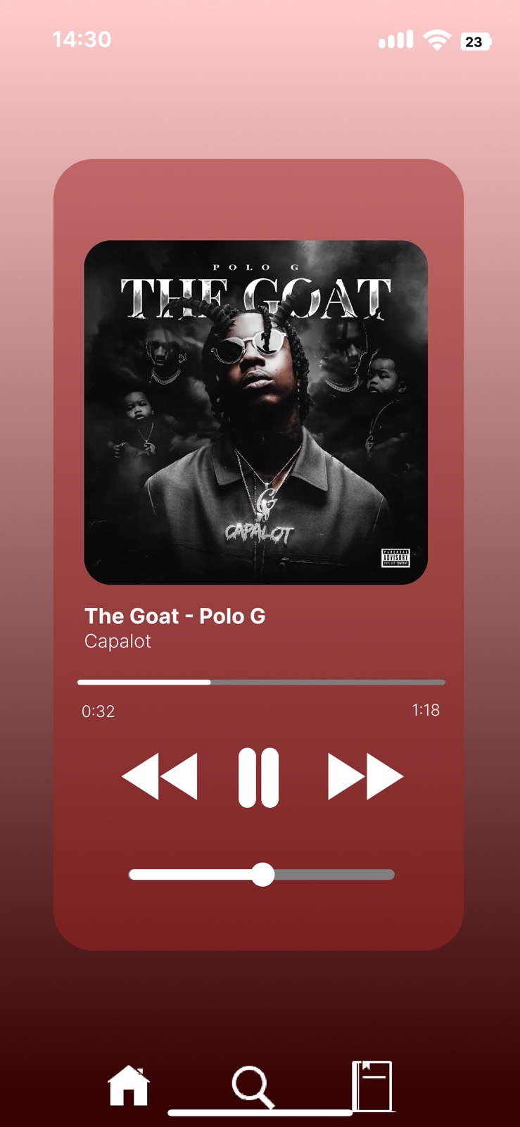
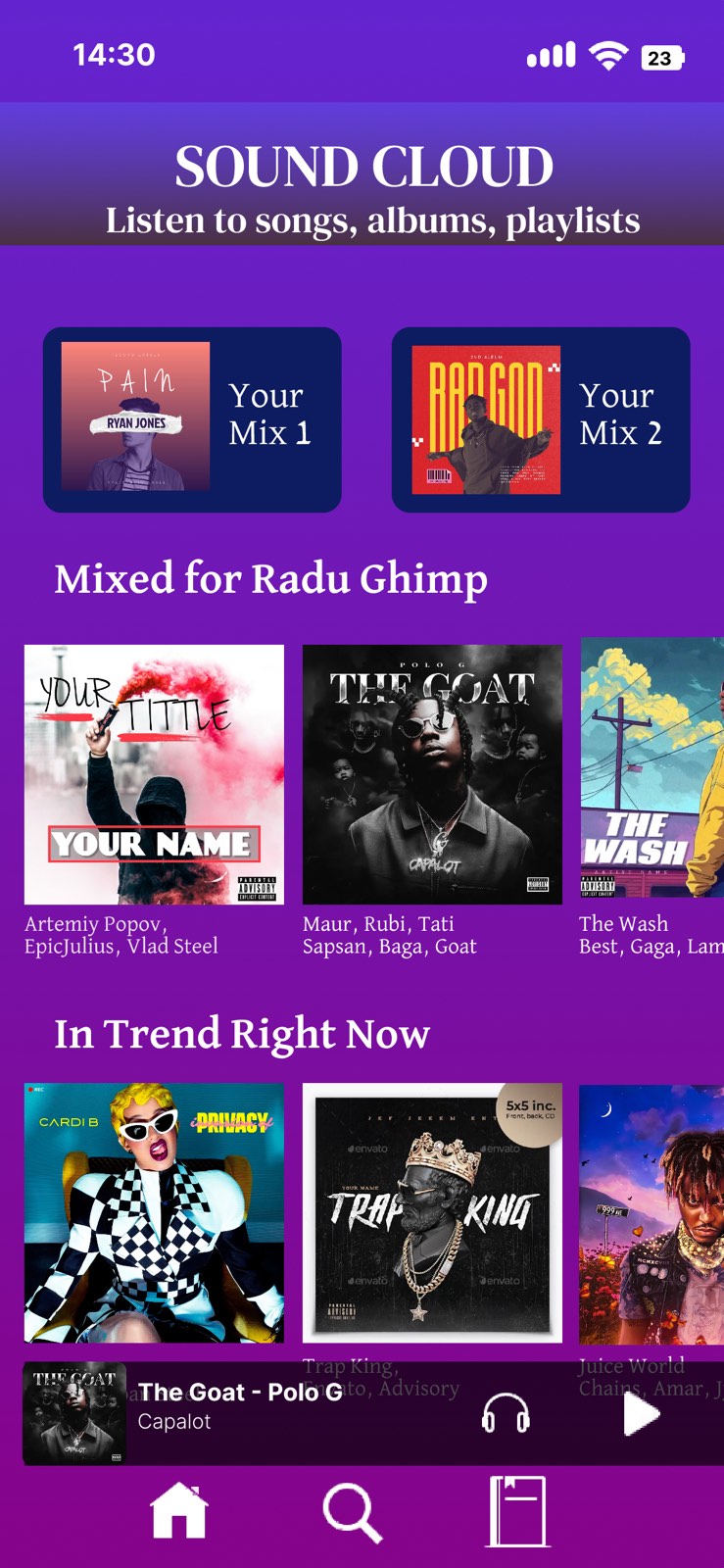
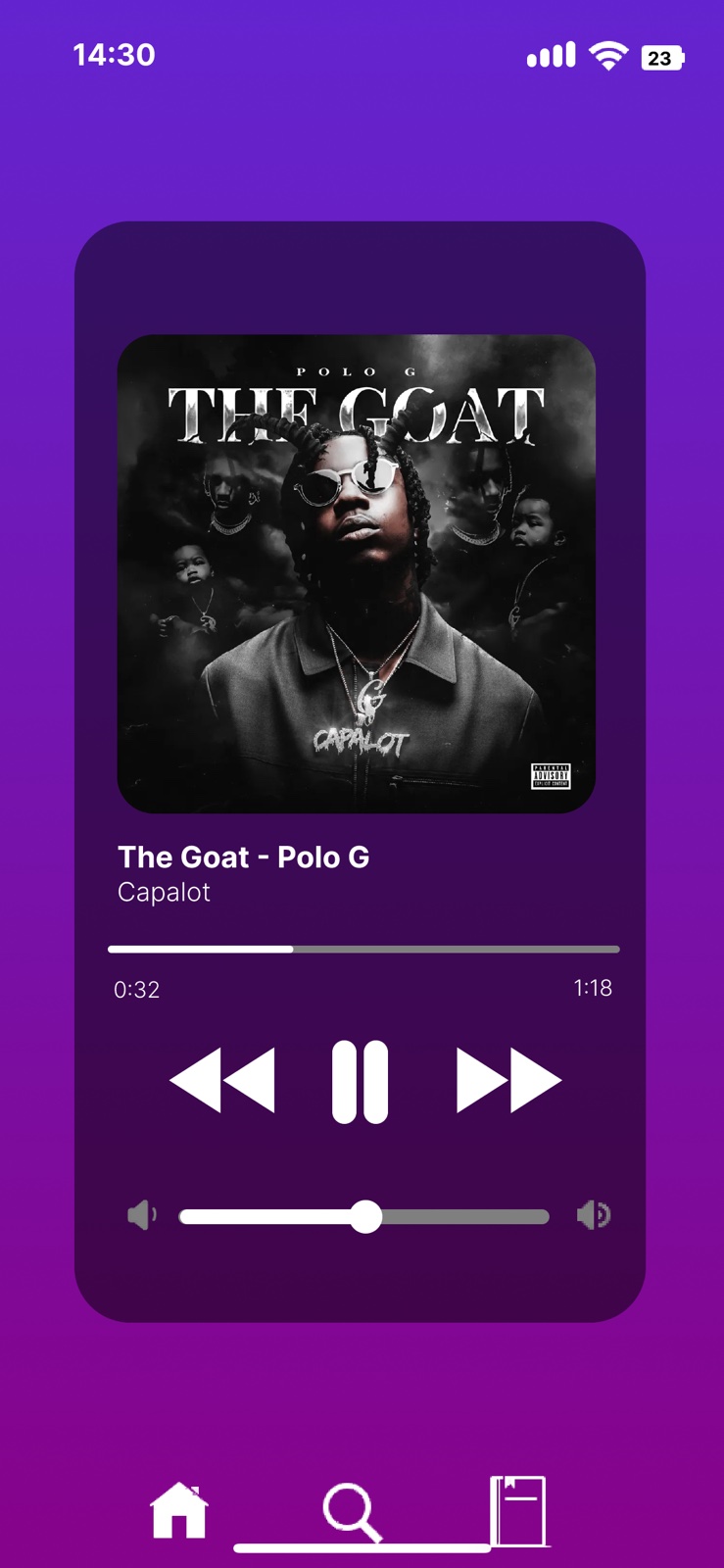
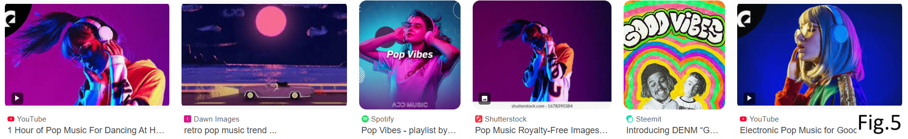
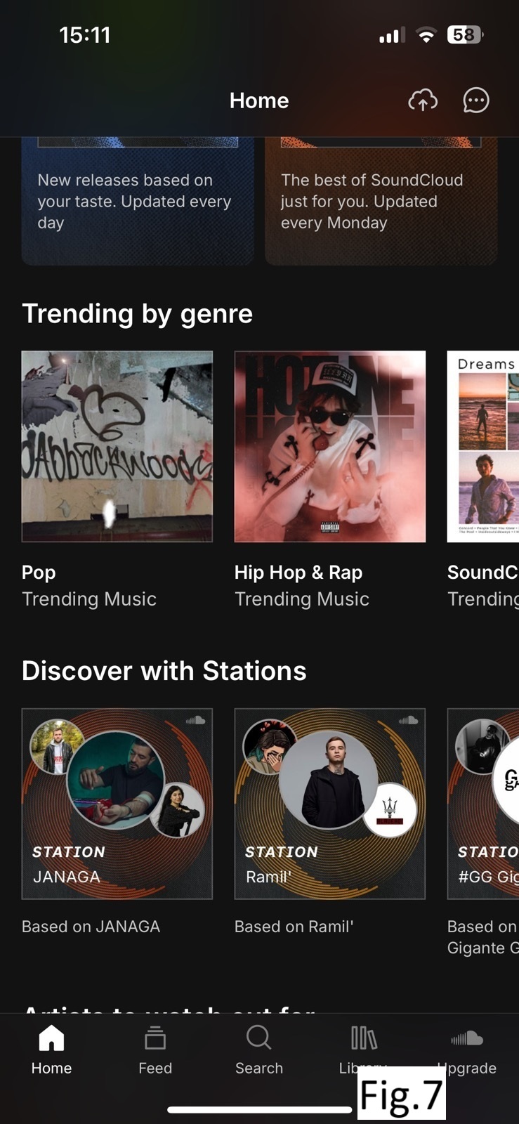
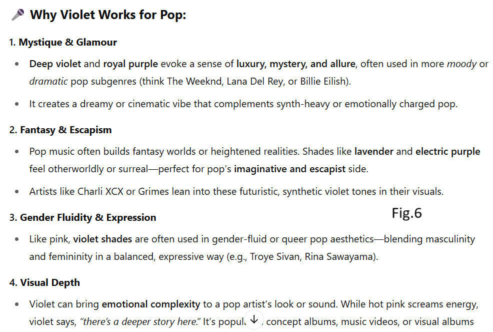
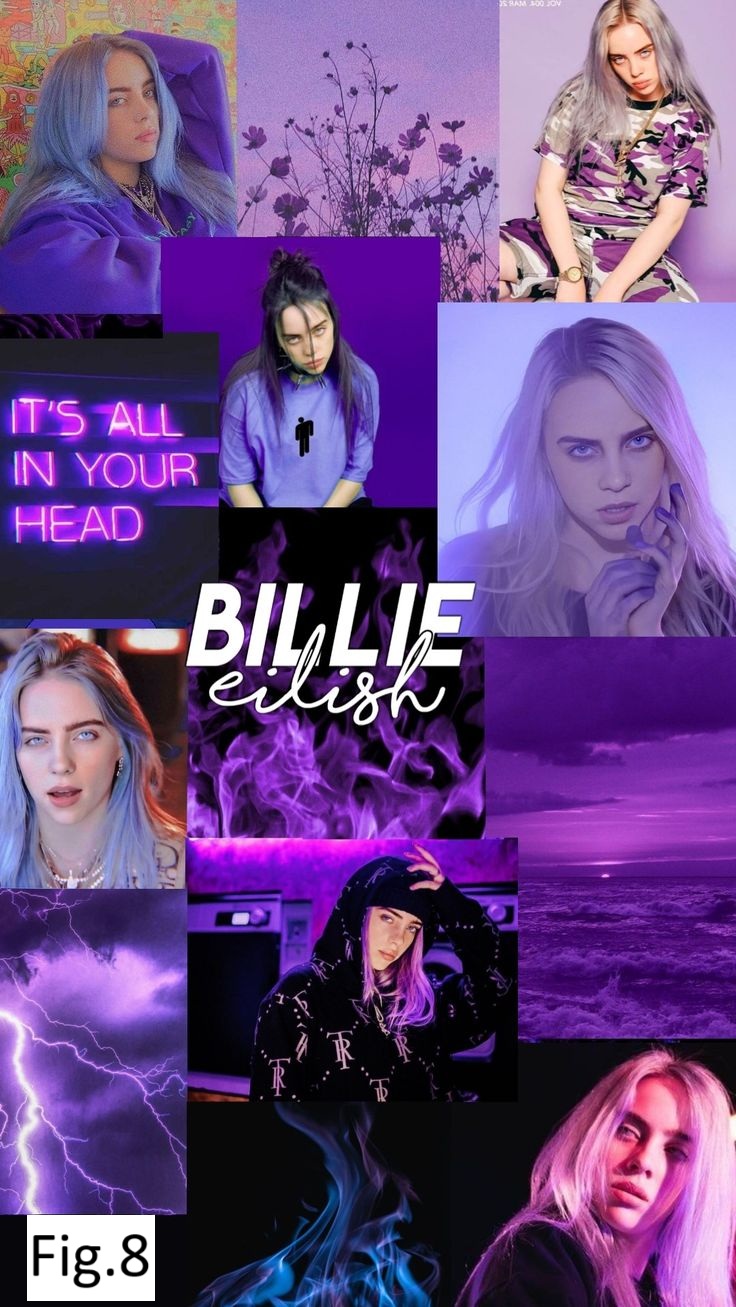
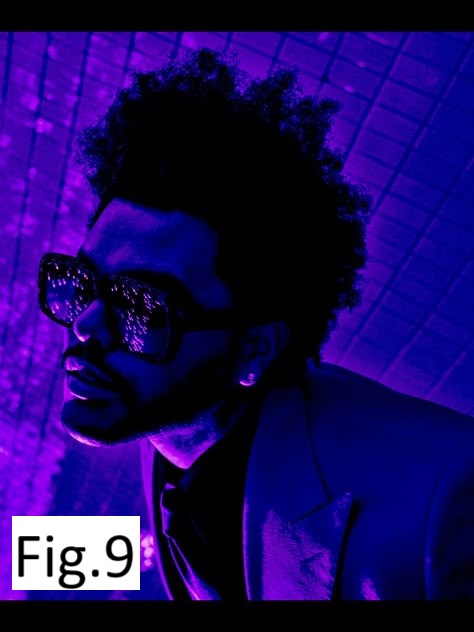
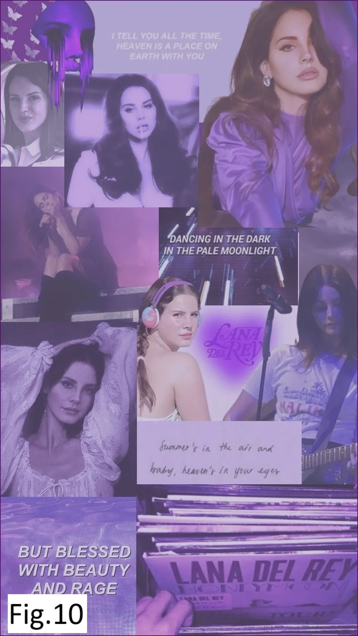
What did I do: I wanted to recrate the app of Sound Cloud in the way I like. First of all I tried to combine the classical music style with pop music (see fig.1 and fig.2). You can see the font and colors I chose are more for classical music but the songs itself are pop style. Wouter said that it is very good that I try to experiment and create my own style but in this situation it is better to follow one style and I chose to do it for pop music. Based on my research I chose the main color to be different shades of violet with blue and I made a gradient out of it because this color gives the vibe of pop music. I searched online for “pop music vibes” and noticed that the most abundant color which caught my eyes attention immediately was different shades of purple. (check fig.5 for some examples I saw) Also I asked Chat GBT for confirmation (check fig.6) and after that I searched some albums of Billie eilish, The weekend and Lana del Ray to check if information from ChatGbt is indeed true so they also use different shades of purple (check fig.8, fig.9 and fig.10) which is going to give a pop music vibe. Besides that, Wouter showed me the difference between a professional app music and mine how all small details make such a huge difference. So he suggested me to look for tiny details and implement them as margins of playlists and having one playlist showed on half on the right side so the user understands that he needs to scroll horizontally to see more playlists available. So that what I did I looked for a lot of small details in actual Sound Cloud app (check fig.7) and recreated them also the music bar which shows the current song playing on the first page which I omitted in the first prototype.
How did it go: I would say that it really went pretty well as Wouter gave me a really helpful feedback which improved my prototype a lot . You can also see how different both versions which I implemented look from each other even though they have more or less same structure.
What did I learn: I learned to recognize small details in an app and how much of an influence they have on an app or website. By focusing on tiny details you can make a non-professional app into professional one the same I did even though my final version is still not the best but still you can see the difference.
Portfolio
Introduction: I made some small iterations on my portfolio based on teacher’s feedback.
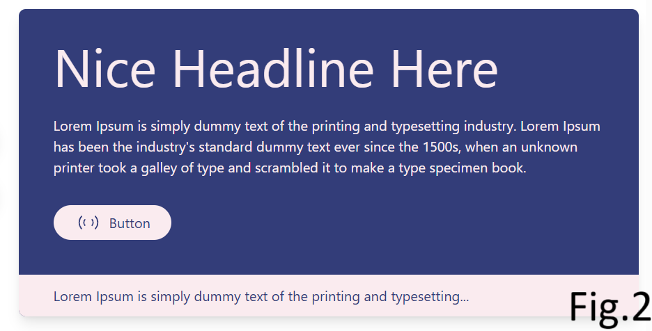
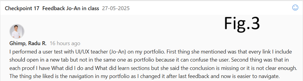
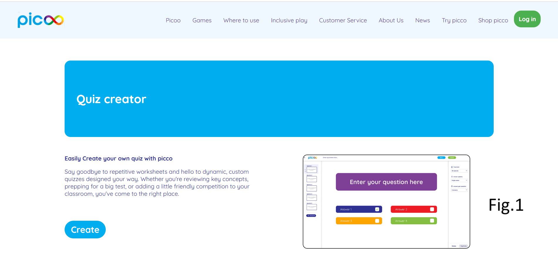
What did I do: Firstly, I changed the navigation of my portfolio after Jo-An feedback (check fig.1) In the beginning I had 3 buttons in the header: Home, Technical skills and professional skills. After that I made one button “Learning Outcomes” with a dropdown menu by hovering with Technical and Professional skillks buttons, which was still confusing for teachers because as Jo-An explained me that I shouldn’t divide the LO into technical and professional. After that I spend some time thinking about it and came up with the navigation which is now so by hovering on Learning Outcomes button a dropdown menu with each LO and by clicking on each one you will automatically will be redirected to the corresponding LO. Other thing is that the first color palette I chose for portfolio wasn’t the best one because of readability. Then I searched online for best 2 colors combination which will not make your eyes tired and will make the text appear more readable I and found the current color palette I’m using now. (check fig.2 for the found template and also you can access this link to see the website: Click here.) Another thing I improved is that I changed the location of every link from my portfolio so by clicking on it – doesn’t open in the same tab as portfolio but creates and opens in a new tab which is a good UI/UX trick so the user doesn’t lose my portfolio tab. I did this by simply adding the target attribute: target = _blank. I came to this decision after performing a user test on Jo-An and she adviced me to do so (check fig.3).
What did I learn: I learned how important is the feedback from professionals (in my case teachers) in order to make iterations and in the end to improve your work.
Picoo Project (User testing)
Introduction: For picoo project I made 2 iterations: first one is about debriefing based on Jo-An feedback and second one is based on user testing.
What did I do: Before performing the user test I implemented the log in pop up on the home page so by clicking on “Create” button the log in appears (check fig.1 to see the home page with “Create” button) meaning the user can’t create a quiz without being logged in. But I also had one more option in my mind to have the log in feature after the user completes his quiz and wants to save it, meaning user can create a quiz without being logged in. During the user test I explained and showed him both options and he said to better have the log in feature in the end after creating the quiz, because if it would be in the beginning he might give up on creating a quiz as it is sometimes annoying when you have to log in on the website you visit for the first time. After this feedback I decided to change the log in pop up in the end after the user created the quiz and wants to save it then the pop up will appear (check fig.2 to see how it looks like).
What did I learn: I learned how to make proper user testing in order to improve your website by making iterations, so based on feedback you change something and make it better.
Picoo Project (Debriefing)
Introduction: I was able to make an iteration on debriefing document of Picoo project based on Jo-An's feedback.
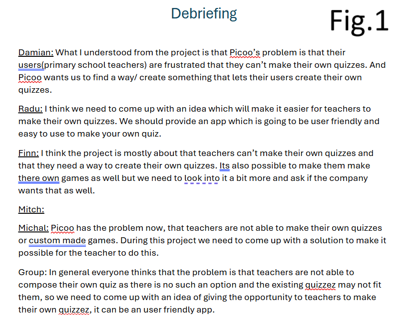
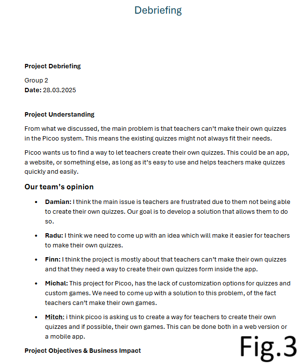
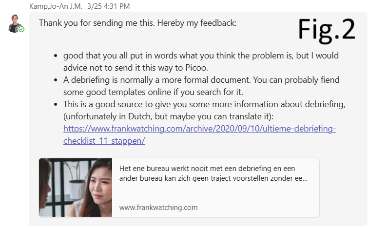
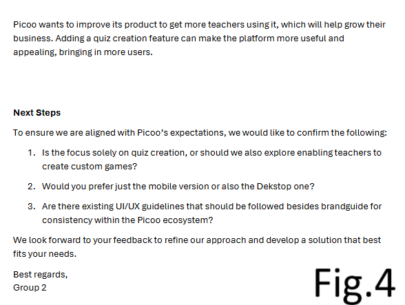
What did I do: In the beginning of UI/UX picoo project we as a group were advised to write a debriefing for picoo company to set the goals clearly for everyone. We decided so everyone writes 1-2 sentences about how they understood the problem and what the solution we can come up with (check fig.1 to see the initial debriefing). But before sending it directly to picoo I decided to show it to Jo-An (UI/UX professional) and get feedback from her (check fig.2 to see her feedback). Her feedback to us was to improve our debriefing by doing it in a more formal way but not as we did it. For this she provided us a source from where we can see examples of good debriefing, how to write a good debriefing and some good templates. Taking all of this into consideration I made some changes to the debriefing document (check fig.3 and fig.4) and made it more formal following a template: added a header indicating group number, the date. After that I added a small introduction with a title “Project Understanding” and in the end I added the “Next steps” section including some follow up questions for picoo to answer.
What did I learn: I learned how to write a formal debriefing and interact with the client by including in the end also the follow up questions. And how important was the feedback from the teacher rather than sending the first version of the debriefing.
First typography poster
Introduction: I made a typography poster for design classes using Adobe Illustrator and got feedback from Wouter.
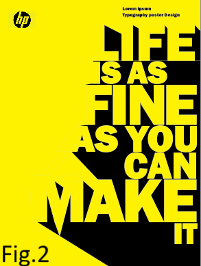
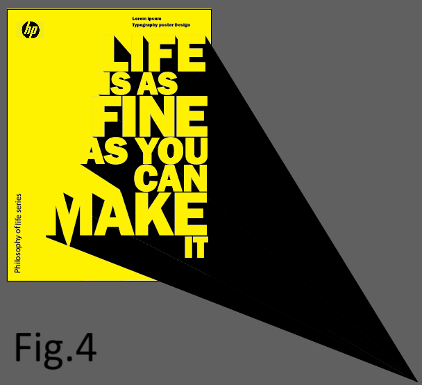
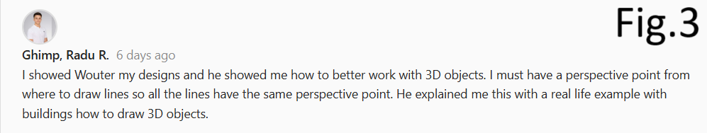
What did I do: Firstly I started with doing something weird and learning adobe tools (check fig.1) After I struggled with placement of each letter and making shadows I came up with this (check fig.2) After that I showed it to Wouter and he said that each shadow must have the same angle and then he explained with real life examples why should it be like that and how to do it (check fig.3 for feedback) then he showed me how to put a perspective point to where all shadows must go to (check fig.4 and see how each shadow goes to one exact point called perspective point) This small change made my poster look more professional rather than having all those shadows with random angles.
What did I learn: I learned what is a perspective point and when to use it in designs and also how important is to get feedback from teachers so I can improve my work afterwards.
Second typography poster
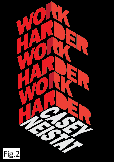
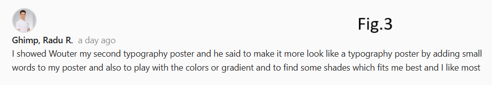
Introduction: I made one more typogtaphy poster during Wouter’s classes and improved it after teacher’s feedback.
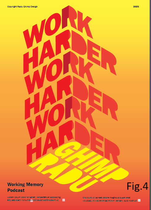
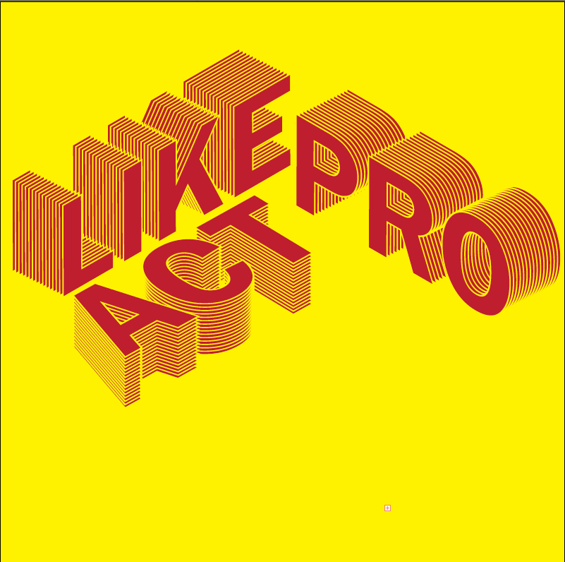
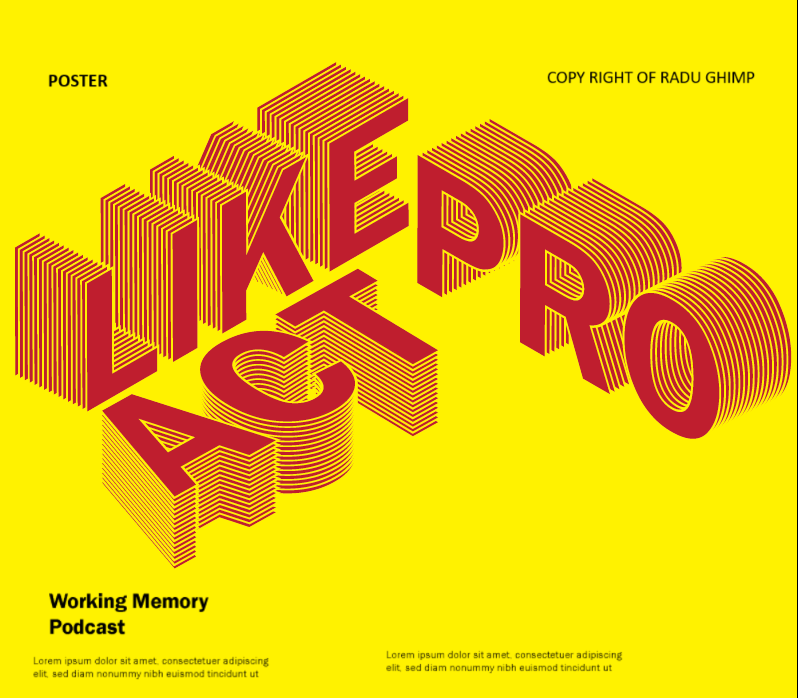
What did I do: Firstly I started learning how to use the necessary tools in order to fake a 3D object in adobe illustrator (check fig.1) After that I started on a new page actually creating that cube out of words and made it with a black background (check fig.2) After that I went to Wouter for feedback and he said that it doesn’t look like a poster and I need to add small words or sentences near my cube like “Copyright from Radu Ghimp” and stuff. Also, he advised me to play with the colors and change the black background and make it in my own way (if needed check fig.3 for his feedback) Based on his feedback I changed my poster and now it looks way more professional and more like a typogropghy poster. You can see in fig.4 how I added a small heading at the bottom and wrote small sentences and at the top added copyright and the year 2025.
What did I learn: I learned to include in a typography poster small headings and sentences to make it look like an actual typography poster and choosing the right shades or gradient for your poster is also an important thing to spend time on. And also I learned how important is the feedback from teachers to improve your work.
Third typography poster
Introduction: Here is one more typography poster I did during Wouter’s classes.
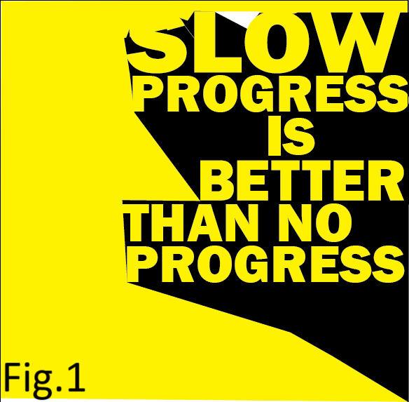
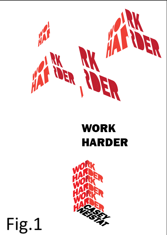
What did I do: I made a small iteration while doing this poster, I added small words, sentences and headings in the background of my poster so it actually looks like a typography poster (check fig.1 and fig.2 to see the difference).
What did I learn: I put this poster in the portfolio to show that I learned more techniques in adobe, for example how to do this kind of 3D letters (check the images on the left).
Project X (Movie website)

Introduction: I made a movie website in react (for more details click here to go to Development LO where I explain everything in details) Also, I was able to make an iteration based on Maikel’s feedback.
What did I do: Firstly, I followed a tutorial on how to create a movie website in react and came up with this version (check fig.1). I showed it to Maikel and we discusssed what else I can change or add and he said to make it possible for the user to search for movies by genre not just by name in case the user doesn’t know the name and doesn’t know which movie to watch. (check fig.2 to see Maikel’s feedback) I did it by adding one more route in api.js file to go to “/genre/movie/list” the same thing I did to search the movie by name but in that case I used the path to get the popular movies: “/movie/popular” (If needed click here to see the full code in api.js file) So in the end, after I made it possible for the user to search by both name and genre of the movie my website looks like this (check fig.3). If you want to actually see how to search a movie by name or by genre click here to see the gif
What did I learn: Regarding technical part I learned how APIs work and from where to get it. Regarding professional part I learned how important is the feedback from teachers because there is always room for improvement and teachers can guide me and say what I have to change and improve.
Development and Version control
Goal: You explore front-end development languages, you write code and document in a version control environment.
Portfolio
Introduction: Personal Experience Portfolio semester 2. Here is the link to the git lab where you can find also the ReadMe file: Click here.
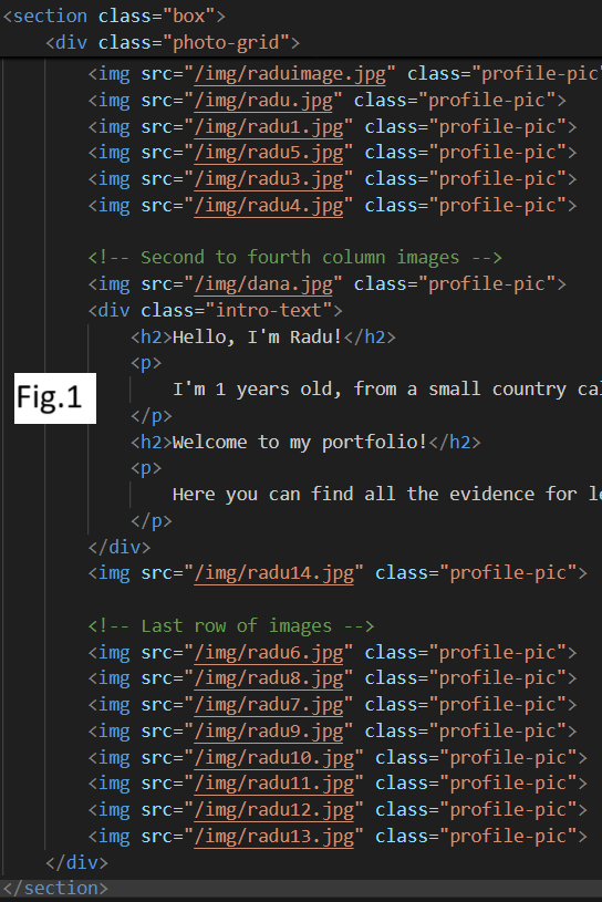
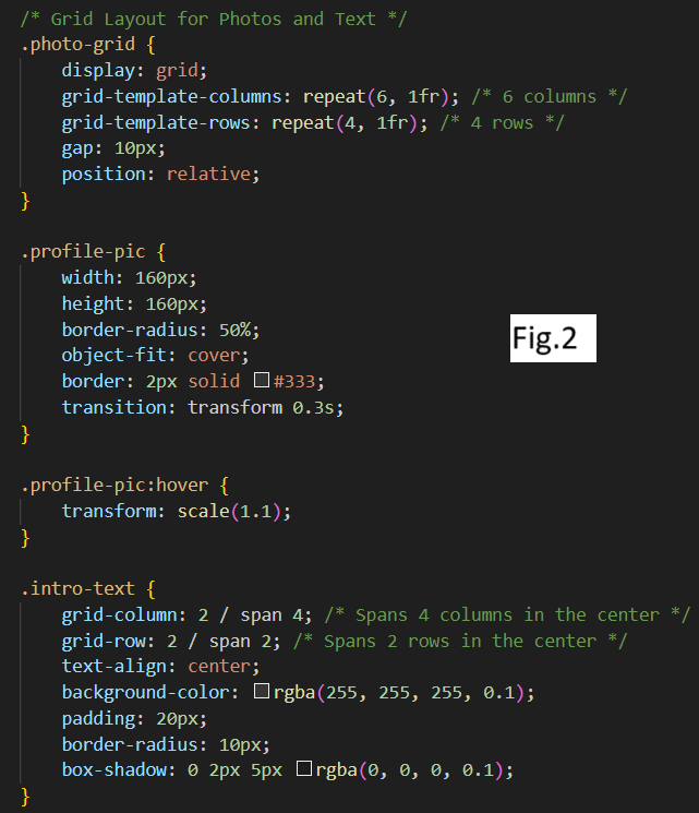
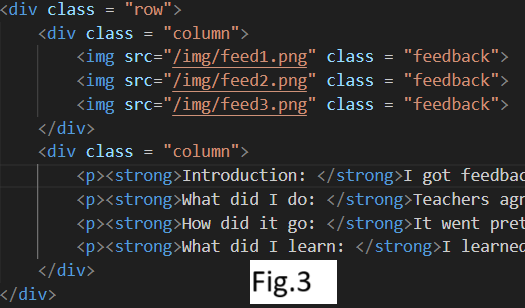
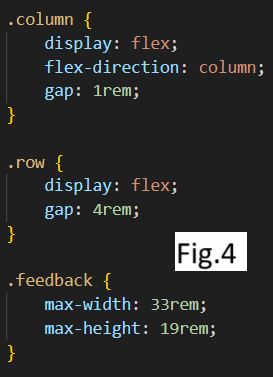
What did I do: I implemented my portfolio for 2nd semester in HTML and CSS which shows my coding skills, not on a very high level I agree but still it shows that at least I know the basics. For example I used the grid in the home page to organize my personal photos in a rectangle with text inside. (see fig.1 and fig.2 both HTML and CSS) I used flex box for organizing the content and pictures the way I want for absolutely every proof in my portfolio, to see an example how it looks like check fig.3 and fig.4 for both HTML and CSS). Also, because of flex box and grid and I used max and min width and height instead of just width and height my website is responsive, not fully responsive because we still need to have some workshops with Maikel about this so in the end I will try to make it fully responsive.
How did it go: Till now it is good, I still have things to improve on and also start using JavaScript. We had 1 workshop about this and I already have a small overview in my mind but still I need to try it myself and practicce a lot.
What did I learn: As I mentioned already the flex box and grid, these are the things that helped me obtain a responsive website as for example in semester 1 we didn’t have to have a responsive portfolio so everything I know about responsiveness is from 2nd semester I learned myself. Also Maikel gave me some advices as to use max and min width and height, workshops about CSS also were helpful for me.
PHP Challenge and CSS
Introduction: PHP challenge and CSS practice
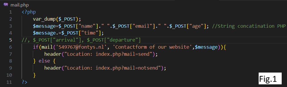
What did I do: I managed to do the PHP challenge from Maikel’s bootcamp after having an introduction to PHP in general. Honestly, before the bootcamp I didn’t even hear about PHP and had no idea what is this. Now I know how to send an automatic email (see fig.1) and know how string concatenation works in PHP after Maikel explained me. He adviced me a really helpful website about PHP where I checked how tags should be written with “$” sign and in which order, so in this way I can get whichever input from the user I want to my email, for example name, surname, arrival, departure and other inputs.
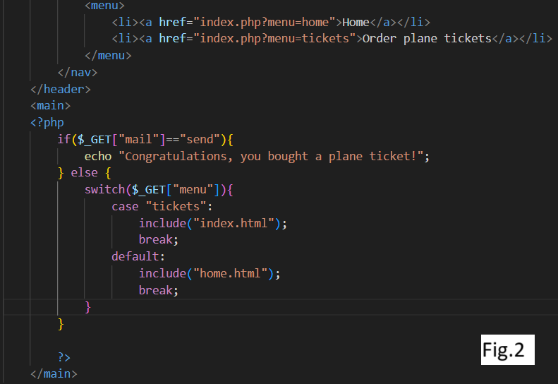
What did I learn: What I learned else is for example showing a congratulation message after the email was send.(fig.2) Also I can put 2 links for example by clicking on each one you will be redirected to index.html for example, (see fig.2) and an important thing is that the nav bar where I put the links stay the same, I don’t have to rewrite them in the new index.html which I suppose saves a lot of time in more complex projects. Also I remembered all types of forms for input I learned in 1st semester and now I had a chance to revise them and used all possible type of forms for this challenge. Now if I speak just about CSS I did few exercises on the website suggested by Maikel (see images on the left side) where I exercised the grid, flex box, position absoulute by using top and left properties.
How did it go: It went very good because I discovered something completely new for me as I said I had no idea about PHP before. And now I already have a good overview and know some basic things to do with PHP.
Picoo Project (responsiveness)

Introduction: For the development project I worked on Desktop version just by myself. Here is the link to the git lab where you can find also the ReadMe file: Click here
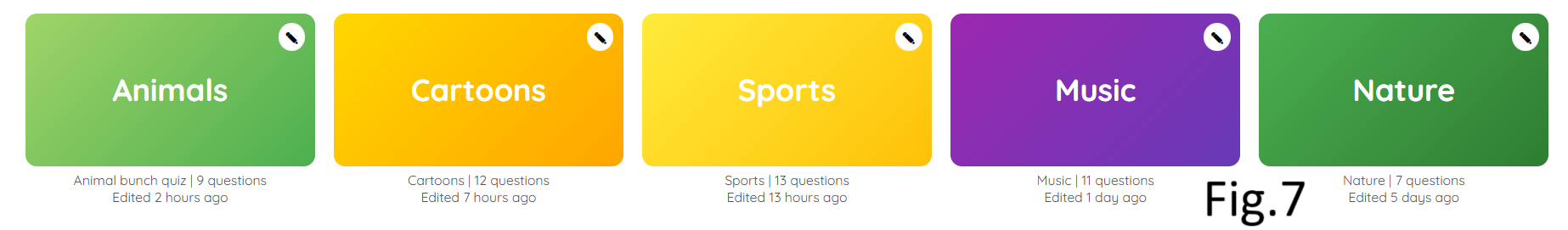
What did I do: Firstly, I created a fully responsive header following a YouTube tutorial, here is the link to the tutorial if you need: Click here. So to create a fully responsive header for both desktop (check fig.1) and mobile phones (check fig.2) I used media queries. I set it till 599px for phones (Click here if you want to see the code) and over 600px for tablets or desktop (Click here to see the code). Obviously that I used flex box in both cases: display: block for phones and display flex with space between for desktop. But in case of mobile version I needed to use some basic JavaScript to trigger the burger menu so by clicking on it vertical menu appears (Click here to see the code.). Also some elements like Quiz creator rectangle, the text under it and the “Create” button (check fig.3) are bigger on desktop and on phones I made them smaller in size (check fig.4) so they don’t take so much space on phone’s screen, I did it using media queries as I mentioned above. And the ‘Create Quiz” image which can be seen on desktop disappears on phones because there is no space for it and it becomes unnecessary. I saw the same thing on the real picoo website how images are not shown on phones but just on desktop (check fig.5 and fig.6) so that’s why I decided to do the same. One more thing about responsiveness is how I used grid for existing quizzes by writing just one line of code I made all those cards fully responsive on all devices (Click here to see the code.). For example, on desktop they will be placed in one line (check fig.7), on tablets they will be 4 cards in a row and 1 underneath (check fig.8), if the screen is a little smaller they will be placed 3 in a row and 2 underneath (check fig.9) and so on till the screen will be less than 600 px, then all cards will be placed in a row (check fig.10).
What did I learn: Everything I mentioned above I learned during this project as I had no idea about existing of media queries. About the grid in general I knew but exactly the min and max grid with auto fill was something new and really useful to know. I knew I can do the same thing with media queries by writing a code for each type of screen but with min and max grid with autofill is so much easier and shorter. First time I saw that kind of grid was in a tutorial on Youtube (Can't put the link as I don't remember which tutorial was that) and after one week Maikel shows the same grid layout in a bootcamp but I already knew it from the tutorial.
Picoo Project (Functionality)
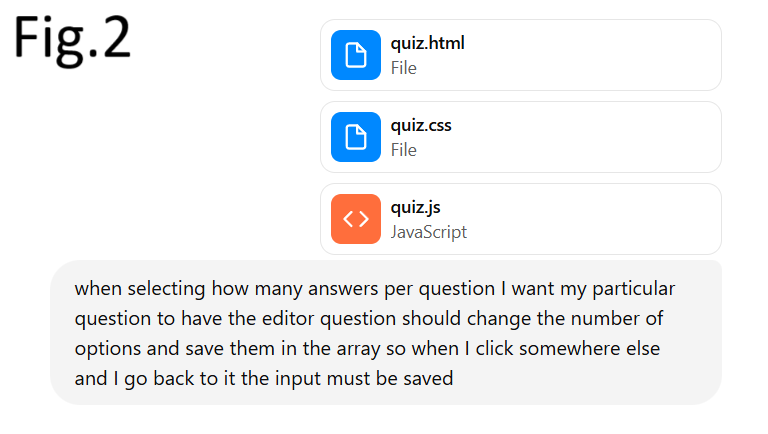
Introduction: Here I’m going to write about the functionalities of “Create Quiz” page has and how I did it.
What did I do: I created a fully functional “Create Quiz” page where the user can easily create his own quiz. So first thing I struggled with was to save user’s input so when he comes back to questions he created he must see the information he wrote. To do this I created a renderfunction() which has another function inside saveCurrentEditor(); (Click here to see the code) and it takes the values from the input fields and after that updates the corresponding question object in questions[]: (Click here to see the code). This means as soon as you click another question the current text and checkboxes are stored in memory. Another functionality is that by clicking on “Add question” button another question appears in the left aside bar by adding a click eventListener to that button and after that a new question object is created in the memory and by inner.html the question appears in the left aside bar (Click here to see the code). Another functionality I added is by clicking on trash button(check the image and you will see in the quiz editor in the top right corner the trash button) the question is deleted from the center where is the editor and also from left aside bar. Here is the code how I did it: Click here. So this code determines which question to delete, then it deletes it from left aside bar, after that it removes the question from the data array, then it renumbers again the remaining questions in the left aside bar and auto-selects the previous question to be displayed in the center (in the editor). One more thing which user is able to do is to select how many answers he wants to have for each question but by default each question has 4 options because I set answerCount:4 in the beginning. But whenever the user chooses 2 or 3 options the answerCount will be updated and it keeps what was already entered so the user doesn’t have to type in again (Click here to check the code)
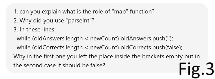
What did I learn: Everything mentioned above was something I learned during this project by the help of AI and tutorials and I find it really useful for the future. I mean all the advanced JavaScript but HTML and CSS I knew how to do just by myself. For some functionalities I had no idea how to implement like saving the data inside an array for example so whenever the user clicks somewhere else and then comes back to the question he typed in already so his input is shown on the screen, so in situation like this when I had no idea how to do it I asked chat gbt to help me do it and then I was trying to understand how and why it works. As I already explained above how each functionality works, and in case I didn’t understand something in the code I copy pasted the line of code and told AI to explain in details (check fig.2 and fig.3 as an example).
Challenge 1
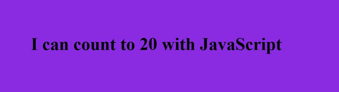
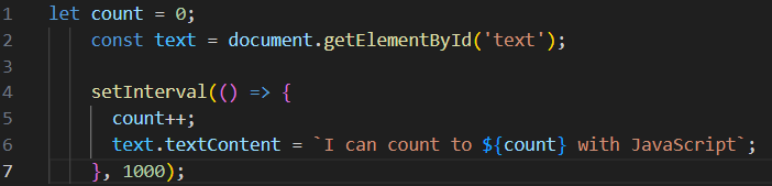
Here is the first challenge! I made number 0 to count upwards every second infinite times unless you restart the page. Firstly, I made the count to start from 0 and inside that function I defined the Text constant by getting element by id. After that I set an interval so it counts upwards by 1 number every second.
Challenge 3

Introduction: Here is the link to git lab where you can also see a short ReadMe: Click here. Linking to git lab was optional but I decided to do so.
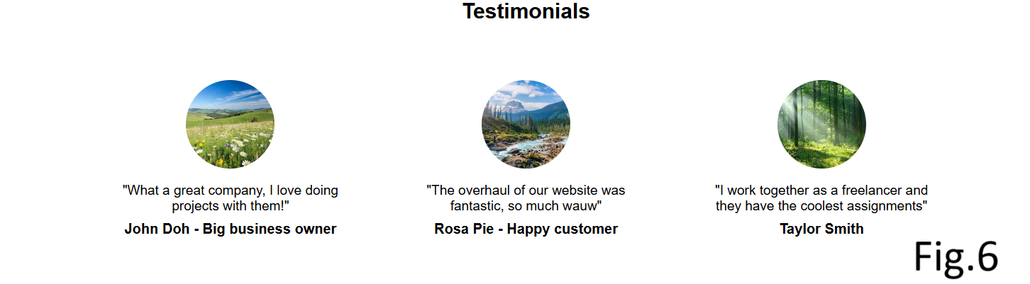
What did I do: I used just HTML and CSS to make a fully responsive page indicated in the challenge. Making it responsive was optional but I did it using media queries, flex box and grid. I put a max width of 767 px for phones and over 768 px for tablets and desktop. (Click here to see the code) I did so because Maikel advised us to use specifically this size of screen for media queries in one of the bootcamps. You can check fig.1 and fig.2 how my page looks both on phones and desktop. Another requirement for the challenge was to use correct semantic elements. For the header I used nav tag with ul tag inside and li tag with links inside and I used icons from “font awesome” website. I used section tag with h1, img, and p tags inside and in the end I made a footer. Click here to view the HTML file. For the pictures I chose a grid layout (Click here to see the code) so they are responsive on all screens. (check fig.3, fig.4 and fig.5) For testimonials I used flex box and grid (Click here to see the code) and check fig.6 to see how they look. And also I made a fixed header which was optional.
Challenge 4
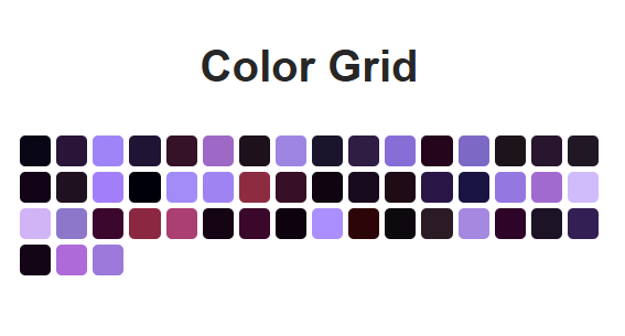
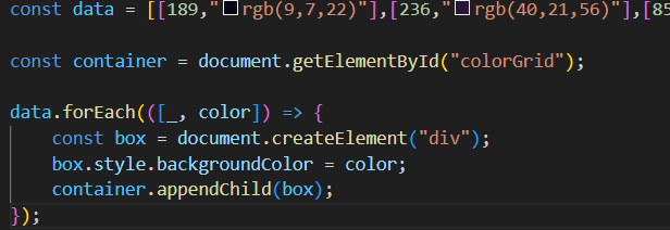
Firstly in HTML I created a div with id=colorGrid which I will need in JavaScript. After that I created a grid layout with 16 columns in CSS. After that in JavaScript I added the array which was given in the challenge and then defined the container constant by id. Then, using a forEach function - iterates over the array and adds div elements to the grid with the background color from the arrayitem. You can check on the left side how it looks and the JavaScript code also.
Challenge 5
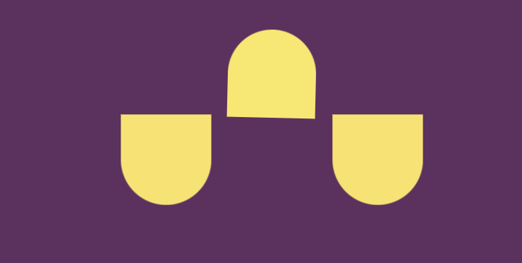
Introduction: I animated the shape I made in CSS battle (if needed you can check the second proof where I mentioned the shapes I made in CSS battle) Here is the link to Git Lab where you can also find a quick ReadMe: Click here.
What did I do: I animated the shape using transition and animation with keyframes which change from 0% to 100% to scale all shapes and to rotate by 10 degrees the top shape (Click here to see the CSS code). Also I added some basic JavaScript so by clicking on any shapes the color changes and the rest remains the same. (Click here to see the code) You can also check the images on the left side to see how shapes look like.
Project X


Introduction: For project X I chose to learn react by doing a website where the user can search for a movie to watch.
What did I do: I made a functional website in react to learn the basic things and have an overview what react is about. For this, I followed a tutorial on YouTube (Click here to see the tutorial on YouTube) where firstly I got instructions on how to install react and then started to understand why should I use react: it is easier to built a complex website because I’m able to divide the website not just into pages but also into components that make up a page and for each component I have a different files (if you need to see how I structured it Click here to go to gitlab) On my website the user is able to search for a movie by name or by genre if for example he is not sure which movie to watch he can search by genre. (check first video on the left side to see how it works) So I followed the tutorial to be able to search the movie by the name but then I added myself the feature to search also by the genre following the same principle. I also changed some styling myself from the tutorial and for example if a movie can’t be found or it doesn’t exist in the middle of the screen will appear a text: No movies found. One more interesting feature I made from the tutorial is being able to save the movie to Favorites by clicking on the red heart and then you can access “Favorites” page to see saved movies and also you are able to remove them from favourites. (check second video on the left side to see how it works).
What did I learn:I learned how react works, firstly I learned how to install react and how to create a react project. Then I understood how components work and how to put them together so they form a page: I created a app.jsx file to put all components together with the path so I can actually access that page in the browser (If needed Click here to see the app.jsx file). One more thing I learned is working with APIs, I used the website from the tutorial to get the movies for my website (Click here to see the website I used for APIs). I had to create an account there and follow all instructions from the tutorial to get the base url and API key which I copy pasted into my js file (if needed Click here to see the js file).